Low contrast
Colors sit close together in depth, creating a softer, more blended impression.

DROPS DE COR / NEW EDITION 2026
Bring seasonal color analysis into the world of prints. Discover the contrast and color temperature that make a pattern feel like you.
Explore the collection ↗
01 / FIND THE BALANCE
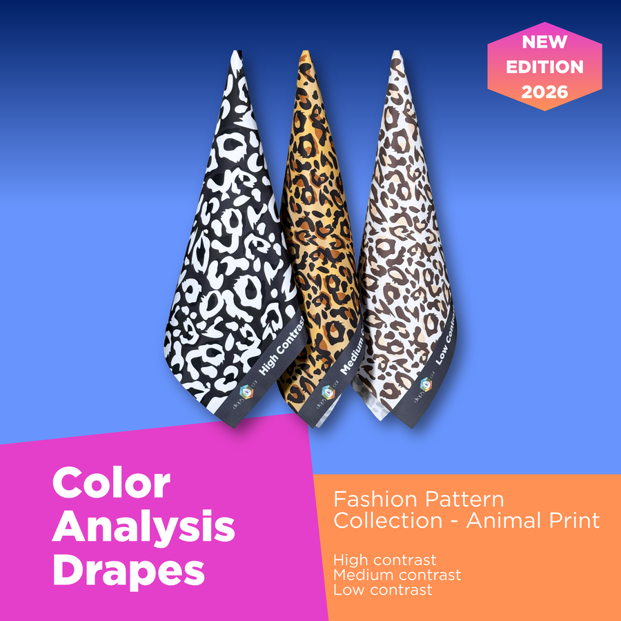
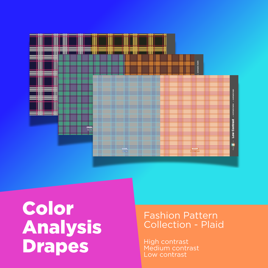
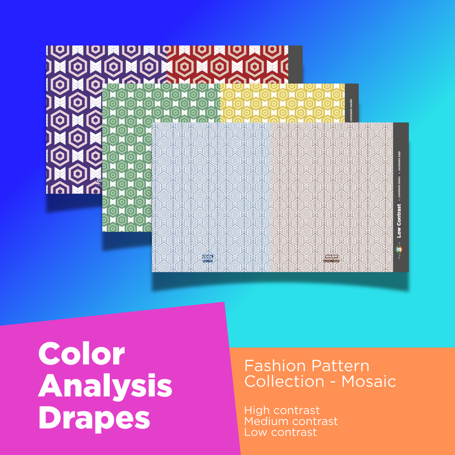
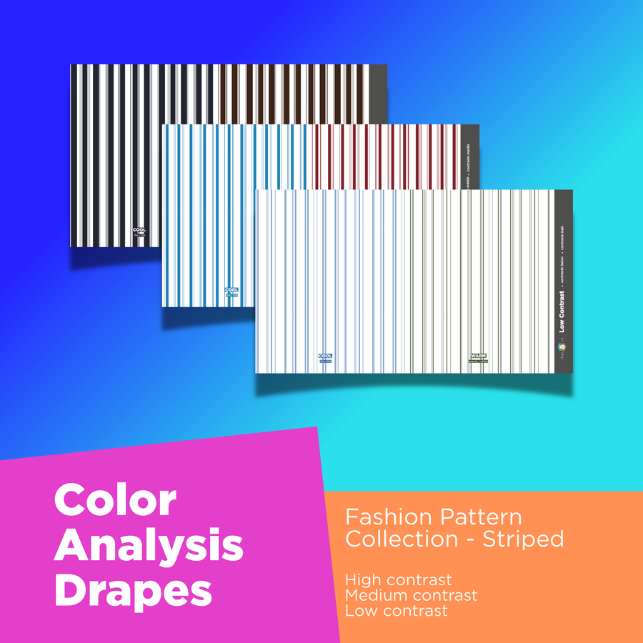
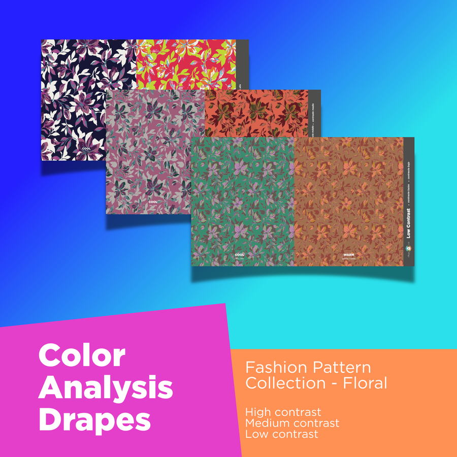
The difference between a pattern’s light and dark elements changes its visual impact. Compare three contrast levels to explore how softly—or boldly—a print works with your client.
Colors sit close together in depth, creating a softer, more blended impression.
A visible difference between light and dark gives the pattern definition.
A strong light-to-dark difference creates a bold, graphic impression.
Color blocks illustrate contrast levels. Explore the actual drapes below.
THE OTHER HALF OF THE PICTURE
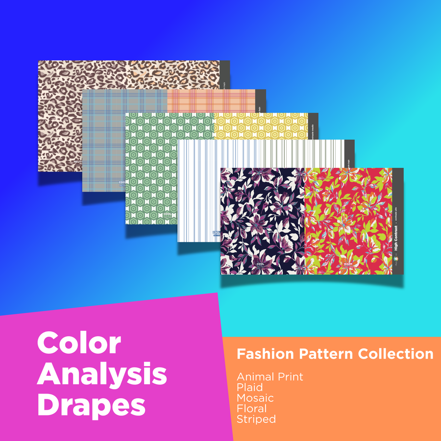
Compare warmer and cooler color combinations alongside contrast. Together, they help you show clients why two versions of the same pattern can feel so different.
02 / SHOP FASHION PATTERNS
Plaid, mosaic, stripes, leopard and florals. Explore the individual drapes or discover the collection set.
03 / FROM DRAPE TO WARDROBE
Use the collection alongside your 12-season color analysis to make pattern guidance more tangible.
Place the low, medium and high contrast options in turn, observing the relationship between the print and the client’s features.
Compare the warm and cool versions, considering the client’s seasonal palette alongside what you observe.
Use the different pattern families to discuss prints the client can look for when choosing outfits.
SPRING · SUMMER · AUTUMN · WINTER
Explore each client’s contrast individually within your seasonal analysis.
THE NEW EDITION
Color, contrast and pattern—in the same conversation.
Shop Fashion Patterns ↗